
One Website, Countless Screens
Responsive web design is a web development approach that creates dynamic changes to the appearance of a website, depending on the screen size and orientation of the device being used to view it. Instead of building separate websites for different devices, responsive design uses flexible layouts, images, and CSS media queries to automatically adapt content for optimal viewing across all screen sizes.
What Responsive Web Design Includes:
- Fluid grids that resize proportionally based on screen width
- Flexible images that scale without breaking layouts
- CSS media queries that apply different styles for different devices
- Mobile-first approach for better performance and user experience
- Touch-friendly navigation optimized for all interaction methods
Remember when websites looked perfect on your desktop but turned into a nightmare of tiny text and horizontal scrolling on your phone? Those days feel like ancient history now, but they weren’t that long ago.
The digital world has exploded with devices. We browse on phones during our morning coffee, tablets while lounging on the couch, laptops at work, and massive desktop monitors at home. Each device has different screen sizes, resolutions, and ways we interact with them.
Creating separate websites for each device used to be the solution. But as Christopher Wren once said about architecture aiming for “Eternity,” the web often feels like it’s “aiming for next week.” The endless parade of new devices with different screen sizes made this approach impossible to maintain.
The stakes are high. Over 3 billion smartphones are in use worldwide, and mobile traffic now accounts for more than half of all web browsing. Google’s mobile-first indexing means your website’s mobile version directly impacts your search rankings. A poor mobile experience doesn’t just frustrate users – it costs you customers and search visibility.
Responsive web design solves this challenge neatly. Instead of fighting against the diversity of devices, it accepts them. One website adapts seamlessly to every screen, providing an optimal experience whether someone finds you on a smartwatch or a 4K monitor.
What is Responsive Web Design and Why is it Crucial?
Imagine a visitor finds your site on the train with a phone, saves it, then opens it again later on a 27-inch monitor at work. With responsive web design (RWD) the layout, images, and navigation automatically reshape, so the experience feels identicalu2014no pinching, zooming, or horizontal scrolling.
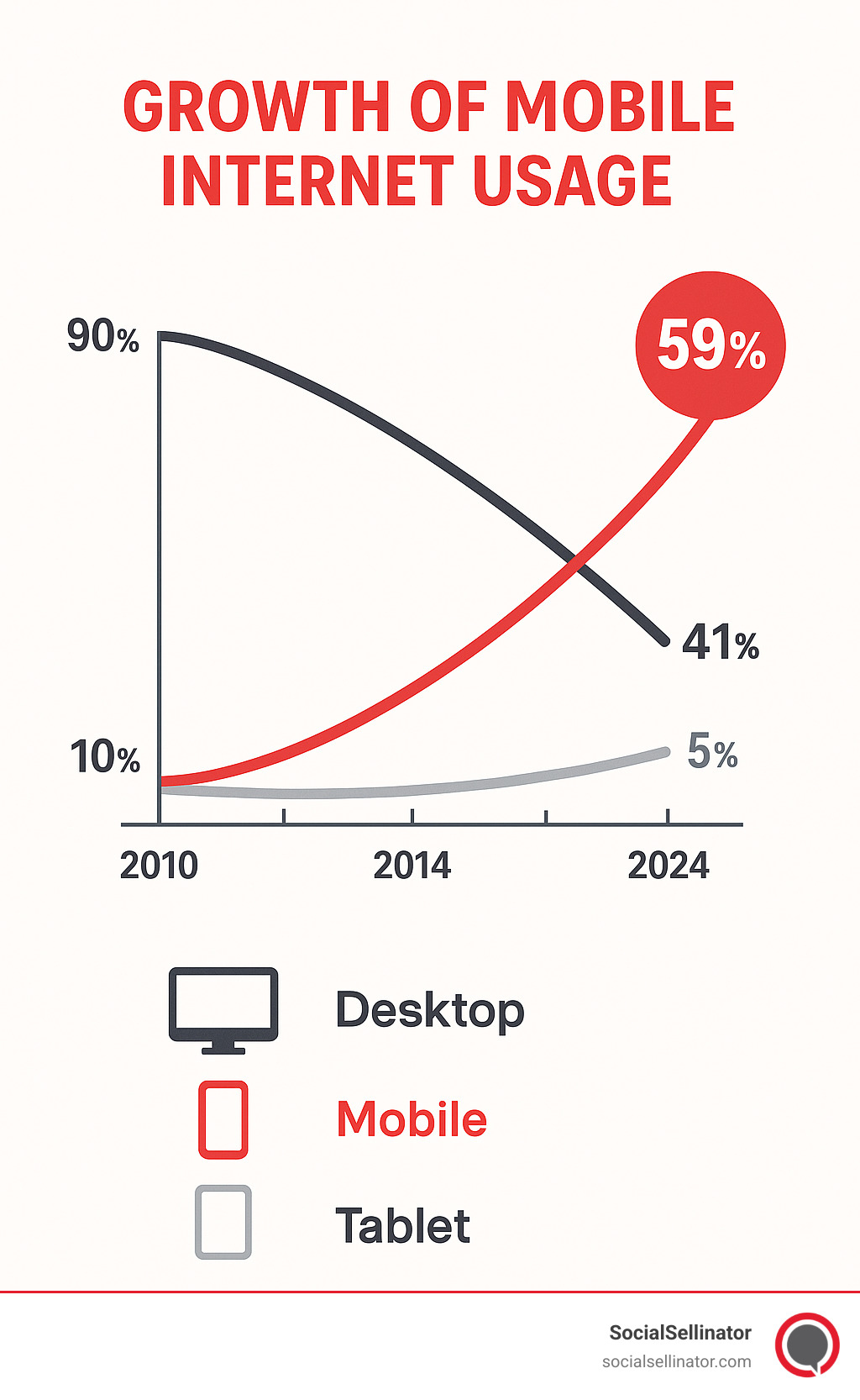
Why does that matter today? In 2023 there were roughly 6.9 billion smartphone users and mobile accounted for about 59 % of global web traffic. This isn’t just a statistic; it’s a fundamental shift in user behavior. Mobile users are often goal-oriented and impatient. They expect speed and convenience, and a delay of just a few seconds can cause bounce rates to skyrocket. Google knows this, which is why its mobile-first indexing now evaluates the mobile view of a page before the desktop version. If the phone experience is poor, search visibility, leads, and sales evaporate. That is exactly why Why is Search Engine Optimization Important to a Business stresses mobile friendliness as a ranking factor.
The Problem RWD Solves: A Multi-Device World
Old websites were built like newspapersu2014fixed widths designed for 1024-pixel monitors. As soon as a 375-pixel phone appeared, everything broke. Text was microscopic, buttons were impossible to tap, and 61 % of users said they would not return to a site that is hard to use on mobile.
For a short time companies launched separate m. domains, but that created double maintenance, inconsistent branding, and SEO headaches. With thousands of new devicesu2014from watches to ultra-wide desktopsu2014building “one site per screen”” quickly became impossible.
